Interior Painting Trends 2026: Best Color Ideas for Modern Homes
Walk into a newly painted home in Singapore this year and you’ll notice something different. The stark white walls that dominated flats for the past decade are quietly stepping aside for something warmer. Sage greens, soft terracottas, and moody charcoal accents are showing up in living rooms from Tampines to Bukit Timah, and it’s not just a passing fad. Every major paint brand, from Pantone to Nippon, has landed on some version of the same idea this year: warm, grounded, and calm.
If you’re planning a repaint in 2026, here’s what’s actually trending, what works for Singapore’s light and humidity, and how to pick colors that won’t feel dated in three years.
Why 2026 Palettes Feel Warmer and Quieter
Pantone named Cloud Dancer, a soft off-white with warmth built into it, as its 2026 Color of the Year. Behr went with Hidden Gem, a smoky jade green. Benjamin Moore chose Silhouette, a burnt umber that reads almost charcoal. Sherwin-Williams is leaning into Universal Khaki. Different brands, same direction: away from the cool, stark greys and bright whites of the past few years, toward tones that feel grounded and a little more personal.
This isn’t really about a single color. It’s a shift in mood. Homeowners are choosing walls that feel calm rather than walls that make a statement, and that shows up as muted greens, warm neutrals, and the occasional deep, moody accent used sparingly rather than everywhere.
Top Interior Color Trends for Singapore Homes in 2026
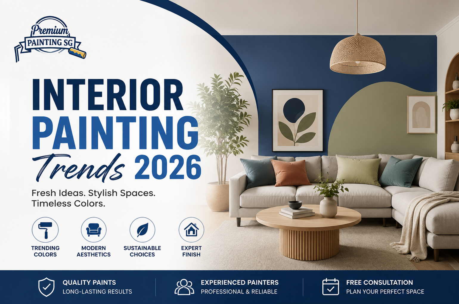
Sage and muted green. This is the standout color of the year, appearing as both Behr’s and Valspar’s top picks globally. In Singapore, it works particularly well in living rooms and bedrooms, and pairs naturally with rattan, timber, and the greenery most condo balconies already have.
Warm neutrals and greige. Beige is back, but not the flat, slightly dated beige from a decade ago. Think taupe, warm greige, and soft clay tones that read as neutral without going stark white or cold grey. These work as a whole-room color or a base to build accent walls around.
Terracotta and warm clay. A step past the beige-and-white era, these earthier tones bring warmth without committing to a full color statement. They show up especially well in dining areas and kitchens, and they photograph beautifully under Singapore’s warm LED lighting.
Deep navy and charcoal accents. Not for the whole room. These darker tones are showing up on a single wall, a bed headboard backdrop, or a home office nook, balanced against lighter surrounding walls so a compact HDB room doesn’t feel boxed in.
Warm off-whites, not stark white. If you still want a neutral, light-filled home (and in a small flat, that’s often the right call), 2026’s version isn’t the cool, blue-toned white of before. It’s a creamier, warmer off-white that still opens up a room but feels softer under both morning sun and evening light.
Best Colors By Room
Living room. Sage green or a warm greige base works for most layouts, especially if your living room gets strong afternoon sun. Add a single deep-toned accent wall behind the TV console or sofa if you want more visual interest.
Bedroom. This is where the deeper, moodier tones earn their keep. A charcoal or deep navy accent wall behind the headboard, paired with warm off-white on the remaining walls, creates the kind of calm, cocoon-like feel most people actually want to sleep in.
Kitchen. Terracotta, warm clay, and soft ochre tones are having a real moment here, particularly on a single feature wall or the space above cabinetry. Washable, low-VOC finishes matter more in the kitchen than almost anywhere else in the home.
Home office or study. Deep blues and charcoal work well in small, enclosed study spaces, especially in condos where the room doesn’t get much natural light to begin with. A darker wall in a small room reads as intentional rather than cramped, as long as the rest of the space stays uncluttered.
Choosing Colors for Singapore’s Light and Climate
Colors behave differently under Singapore’s equatorial light than they do in paint brand marketing photos shot in cooler climates. A few things worth knowing before you commit to a shade:
North-facing rooms tend to get cooler, more consistent light throughout the day. Warm tones (terracotta, warm greige, sage) help balance this out and stop the room from feeling flat.
South-facing rooms get more intense, direct sun. Cooler greens and blues can visually “cool down” a room that already runs warm from strong afternoon light.
Humidity is non-negotiable. Regardless of color, look for washable, mould-resistant paint, particularly in kitchens, bathrooms, and any wall near an aircon unit prone to condensation.
Low-VOC matters more than it used to. Most Singapore homeowners now default to Green Label certified, low or zero-VOC paints, which means less smell and a shorter wait before the room is usable again, a real consideration if you’re painting an occupied home rather than an empty one.
Beyond Color: Finishes Worth Knowing About
Color isn’t the only thing that changed this year. A few finish trends are showing up alongside the new palettes:
Limewash and cemento finishes. These create a mottled, slightly weathered texture that mimics natural plaster or stone. They photograph beautifully but need a painter who’s actually done them before, since the technique is very different from a standard roller application.
Accent walls with a purpose. Rather than a random pop of color, 2026’s accent walls tend to define a zone, mark off a reading nook in an open-plan HDB living room, for instance, rather than just breaking up a blank wall.
Monochromatic “drenching.” Painting built-in cabinets, doors, and trim the same color as the walls around them, so they visually disappear rather than stand out. This works particularly well in smaller flats where you want the room to read as one continuous space rather than a collection of separate elements.
HDB vs Condo vs Landed: What Actually Works Where
HDB flats. Compact layouts benefit most from lighter, warmer neutrals as the main color, with a single deeper accent wall to add character without shrinking the room visually. Dusted pastels also work well here for bedrooms.
Condos. Slightly more room to play with deeper tones, especially in bedrooms and studies where you’re creating a defined, cozier zone within an otherwise open layout.
Landed homes. More wall space and generally better natural light mean you can commit to deeper, richer colors, like full olive green or charcoal rooms, without the space feeling smaller the way it might in a flat.
How to Test a Color Before You Commit
Paint swatches under fluorescent hardware store lighting almost never match how a color looks on your actual wall. Before committing to a full room:
- Get a sample pot and paint a section at least 1m by 1m, not just a small swatch card
- Check it at three different times of day, morning, midday, and evening under your own lighting
- Look at it next to your existing furniture and flooring, not in isolation
- If you’re unsure, ask your painting contractor for a color consultation before the quote is finalised, most experienced painters have seen these shades applied dozens of times and can tell you how they’ll actually read in your unit
Get a Color Consultation Before You Commit
Picking a color from a catalogue is one thing. Seeing how it actually looks on your walls, under your lighting, next to your furniture, is another. Premium Painting Singapore (AR Rahman Builders Pte Ltd) has been helping homeowners across HDB, condo, and landed properties choose and apply colors that work for their specific space for over 15 years, with a 4.9 rating from 200+ Google reviews.
Send a few photos of your room over WhatsApp and the team can talk you through which of this year’s trending colors would actually suit your layout and light, before you commit to a full repaint.
Get a free quote and color consultation: premiumpainting.sg/contact WhatsApp: +65 9774 0827
Frequently Asked Questions
What is the most popular interior paint color in Singapore for 2026?
Sage and other muted greens are the standout trend, alongside warm neutrals like greige and terracotta. Deep navy and charcoal are trending as accent colors rather than whole-room shades.
Is white still a good choice for HDB flats in 2026?
Stark, cool white has fallen out of favor. Warmer off-whites and creamy ivories are the preferred neutral base for 2026, offering the same space-opening effect without feeling cold or clinical.
Should I paint my whole flat one color or use accent walls?
Most 2026 designs use a light or neutral base across most walls, with one deeper accent wall to define a zone, like a headboard wall or a reading nook, rather than committing an entire room to a bold color.
What paint finish is best for Singapore’s humidity?
Washable, mould-resistant, low-VOC paint is recommended throughout the home, and is particularly important in kitchens, bathrooms, and walls near aircon units where condensation is common.
How do I know if a color will work with my room’s lighting?
Paint a large test swatch, at least 1m by 1m, and check it at different times of day. North-facing rooms usually suit warmer tones, while south-facing rooms with strong direct sun often look better with cooler greens or blues.
Ready to bring one of 2026’s trending colors into your home? Get a free quote from Premium Painting Singapore or WhatsApp a few photos of your space for a same-day estimate.